Classic – and serious – failure of infographic design. This time: PriceWaterhouseCoopers!
Three #infographics in one article -and all wrong! This is why even PWC should care about #infographic artists! #Unbelievable
Starting with the first chart: Combining two questions (have you faced a crisis in the past and do you expect one in the future) into one graph doesn’t match the relation of answers. Some of the CEOs may have suffered a crisis in the past but will at the SAME TIME expect one in the future. So these CEOs are represented double in the one chart, distorting the real relation between CEOs which do and did not consider any crisis and the ones how do! The ones who do, are overrated, as they are listed once on the left and again on the right at the same time!

http://www.pwc.com/gx/en/ceo-agenda/pulse/PwC-Crisis-Pulse-v8-03.jpg
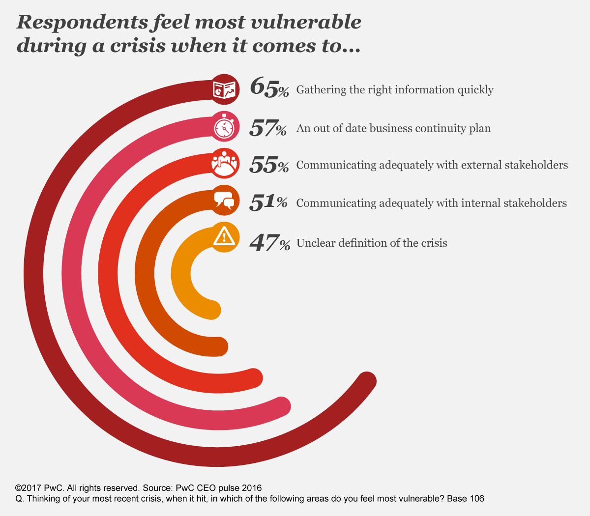
The second chart about vulnerable organisations in the article shows 47% percent compared to 65% in a ratio of estimated 1:12! Yes it looks great to warp a bar chart, BUT: It’s a bar chart because you CANNOT warp it!

http://www.pwc.com/gx/en/ceo-agenda/pulse/PwC-Crisis-Pulse-v8-02.jpg
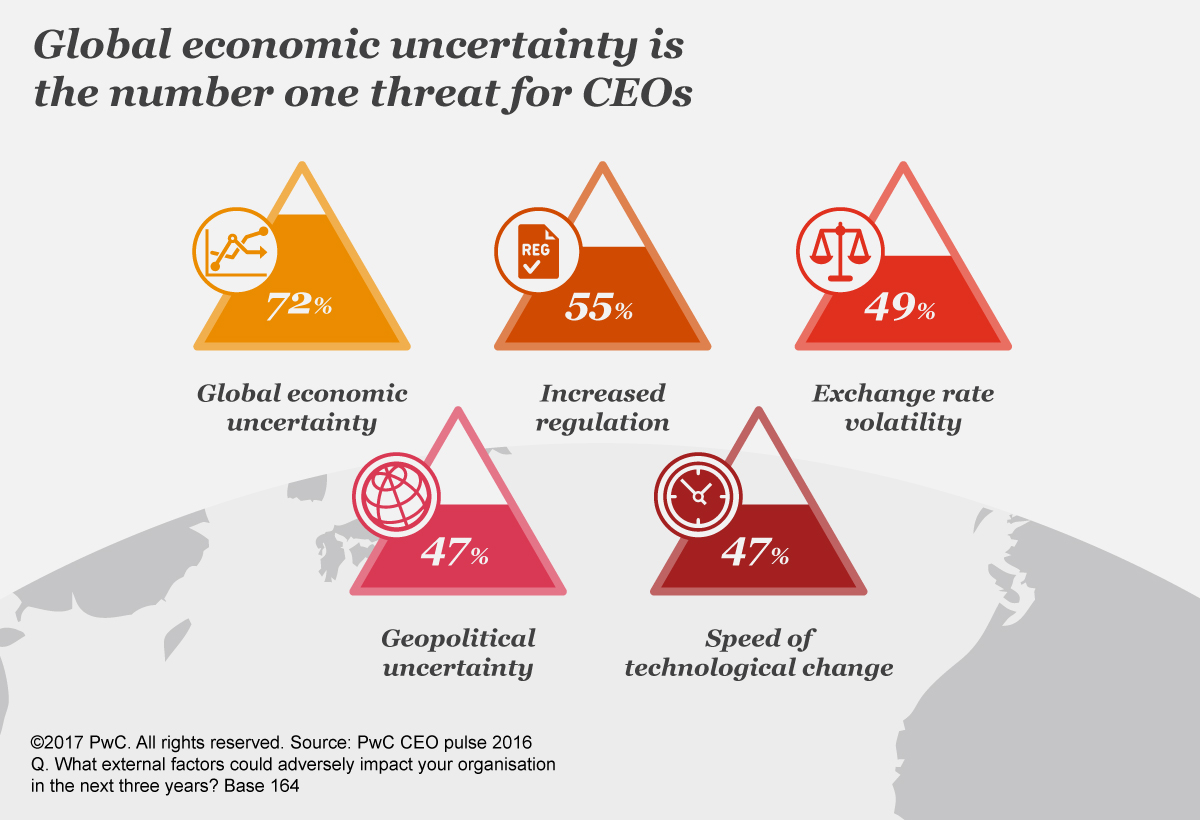
And the third chart about economic uncertainty – a comparison of areas, as they use pyramids instead of bars – compares 72% with 47% as a surprising visual relation of estimated 1.1:1, so completely underrated.
This is something you should avoid when dealing with simple charts: At least the visualizations should represent the values properly. – But there is a way out, and we can help you!
Infographic trainings by ixtract
 Menu Mobile
 Menu Mobile